Discngine & UserStudio: Uplifting User Experience in life science research applications
We live in the century of the internet. Kids now grow up with a smartphone on their hands and by the age of 3, some are able to send messages to their relatives on their own! We all are used to simple, easy to use online applications, being Facebook, Instagram, and others used quite routinely. We are in fact exposed and used to good designed and intuitive applications. However when it comes to scientific applications… well… let’s say “intuitive” and “well designed” are not the first words that would pop up in our minds to describe them. At Discngine we have many years of experience developing web applications for life science research that are user friendly, intuitive, and with good design, but sometimes our experience and knowledge are not enough when it comes to bigger and more challenging projects like our structural bioinformatics collaborative platform: 3decision.
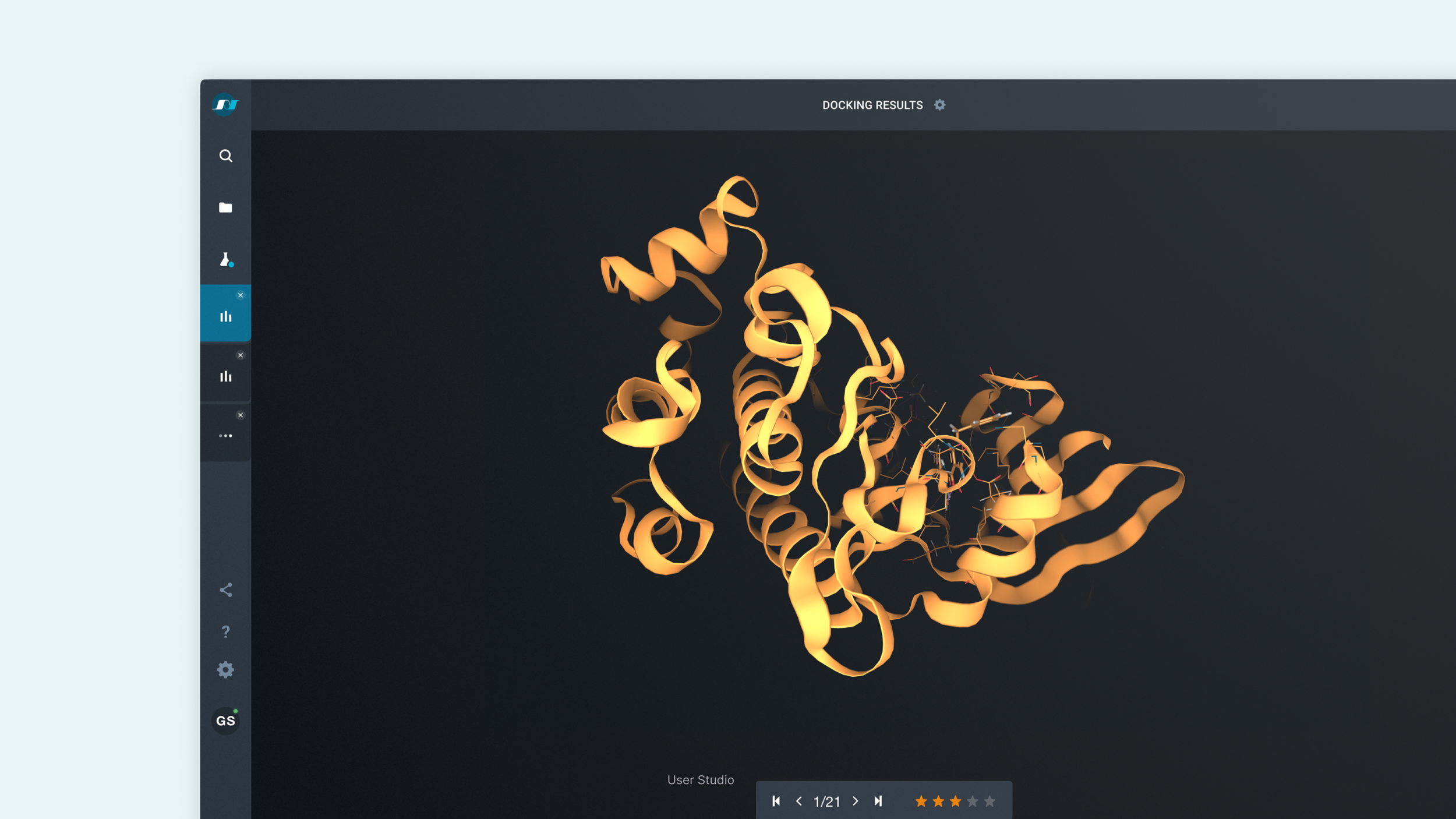
Recently, 3decision was complemented with two new features (subpocket search & interaction search) and a radically new User Interface (UI) that brings the User Experience (UX) to a new level. This new UI/UX design is the result of a collaboration between UserStudio (a company specialized in UI/UX design without previous knowledge on life sciences research topics) and the 3decision team (experts in life sciences and programming but without much previous experience on UX design). It was a challenging and nurturing experience with a very good outcome which we deem important to share with others.
In order to tell the story of this interesting collaboration, we gathered people from both Userstudio and the 3decision team to answer a few questions.
The project was conducted in a 7 steps process over a few months period, as proposed by UserStudio, and it turned out very effective. (Credit image: Flaticon.com)
Can you please, briefly introduce yourself, your company, and your role inside this company?
I am Elodie, a web-developer in 3decision’s team. I primarily work on the front-end but sometimes also get involved in the back-end development. I joined 3decision’s team two years ago looking for new challenges. Not being familiar with life sciences has certainly been a big one. But here we are! We complement one another within the team and learn from each other skills and backgrounds every day!
Our company, Discngine, has just celebrated its fifteenth anniversary and supports life science research (mainly for pharmaceutical and cosmetic companies) through a wide panel of software and services. We are about 50 people working here, most of which have dual expertise in science and informatics.
Hi, we are Anne-Charlotte Volle and Matthieu Savary from User Studio, the French, pioneering Innovation by Service Design studio.
We’ve been designing digital and tangible experiences for private and public organizations of all sizes for more than 10 years now. We build very tight-knit relations with our clients’ teams to design complex, B2B and B2C software such as RATP’s (Paris public transit system) main in-station and onboard information displays aimed at millions of passengers daily, Withing’s Aura (their smart sleep product) mobile app for quantified self addicts or Discngine’s ultra-specialized structural knowledge platform for scientists. We help them throughout the process, from defining their value proposition to designing their interfaces to the last pixel and following up on their development sprints. With the constant aim of turning them into more intuitive, more desirable, and more human services.
“User Studio, the French, pioneering Innovation by Service Design studio”
Our roles? Anne-Charlotte was the Art director and lead UX/UI designer for Discngine’s 3decision project and Matthieu is one of the founders of User Studio and acted as a Creative Director and technologist. We’ve worked as teammates on various UX/UI projects. Anne-Charlotte is our go-to person whether there is a strong need for static and motion graphic skills in order to translate complexity into something that can be easily appropriated by targeted users.
Can you quickly describe 3decision and explain its purpose?
3decision is a biomolecular structural data management and analytics software solution, aiming to facilitate the use of structure-based analysis in life sciences research projects. It provides the project teams with a collaborative web-based workspace where they easily can mine and analyze structural data such as 3D structures of protein-ligand complexes.
The software was developed to fill a gap in the structure-based drug discovery toolbox. There was a need for a solution that combined a complete protein structure repository with a front-end adapted to both experts and novices in structural analytics. In 3decision, we register both public and in-house structural data, along with derived metadata. The front-end is designed to help the whole drug discovery team to generate new ideas and make smart decisions based on structural data.
Can you rapidly explain User Studio’s mission and the approach you are using to fulfill this mission?
3decision was originally designed to meet the needs of a large variety of users. Having evolved, iteration after iteration, into a more and more complex tool by following users' requests and Discngine's developers’ intuitions, the solution was showing a lack of intuitiveness and desirability. Before our intervention, users could not navigate through the software and were not autonomous enough to use all the functionalities offered by 3decision.
Discngine came to us to optimize 3decision’s user experience, in order to turn it into a delightful product for its users to use, thus turning it into a better commercial asset.
“We believe that professional tools deserve to be desirable to use, just as general public apps and consumer electronics are nowadays! ”
Experience has taught us that it’s very strong leverage for helping pros in liking their jobs.
Why did you decide to redesign the software?
The first version of 3decision was designed to expose functionalities and a wide variety of tools in an interface composed of widgets. The users could customize the interface as they wish, depending on what they wanted to do. Soon questions rose from our customers. Most of them were lost in the application, not knowing how to reach their goal, what widget to use, how to compare, analyze multiple structures at the same time, where their data were going, and so on… In the meantime, 3decision kept growing in terms of functionality.
“Consumer care is one of our core values at Discngine and while we pushed forward to bring always more possibilities to users, we realized that we had a functionality-rich product rendered useless because it was too complex to use. ”
We, therefore, needed to rethink the whole workflow, navigation, and how functions were exposed. This meant a lot of work and we still wanted to keep adding new features to the application. Having limited resources and not so much experience for the task ahead, some of us first explored and sketched several solutions without much agreement or a clear action plan. We felt the need for some external and experienced advice. After discussions with different UI/UX experts without much success, we finally found User Studio, a UX specialized company that quickly understood our needs and provided a clear and flexible plan to reach our goals.
How would you describe the collaboration with User Studio?
We felt well-guided through the challenge we were facing. In the same way as I had when I joined Discngine, the User Studio team had to cope with a very steep learning curve to understand the backstage of drug design. It was an exchange of knowledge in our respective fields of work. We gave them input on core concepts in life science research and the Discngine spirit.
“We felt well-guided through the challenge we were facing. ”
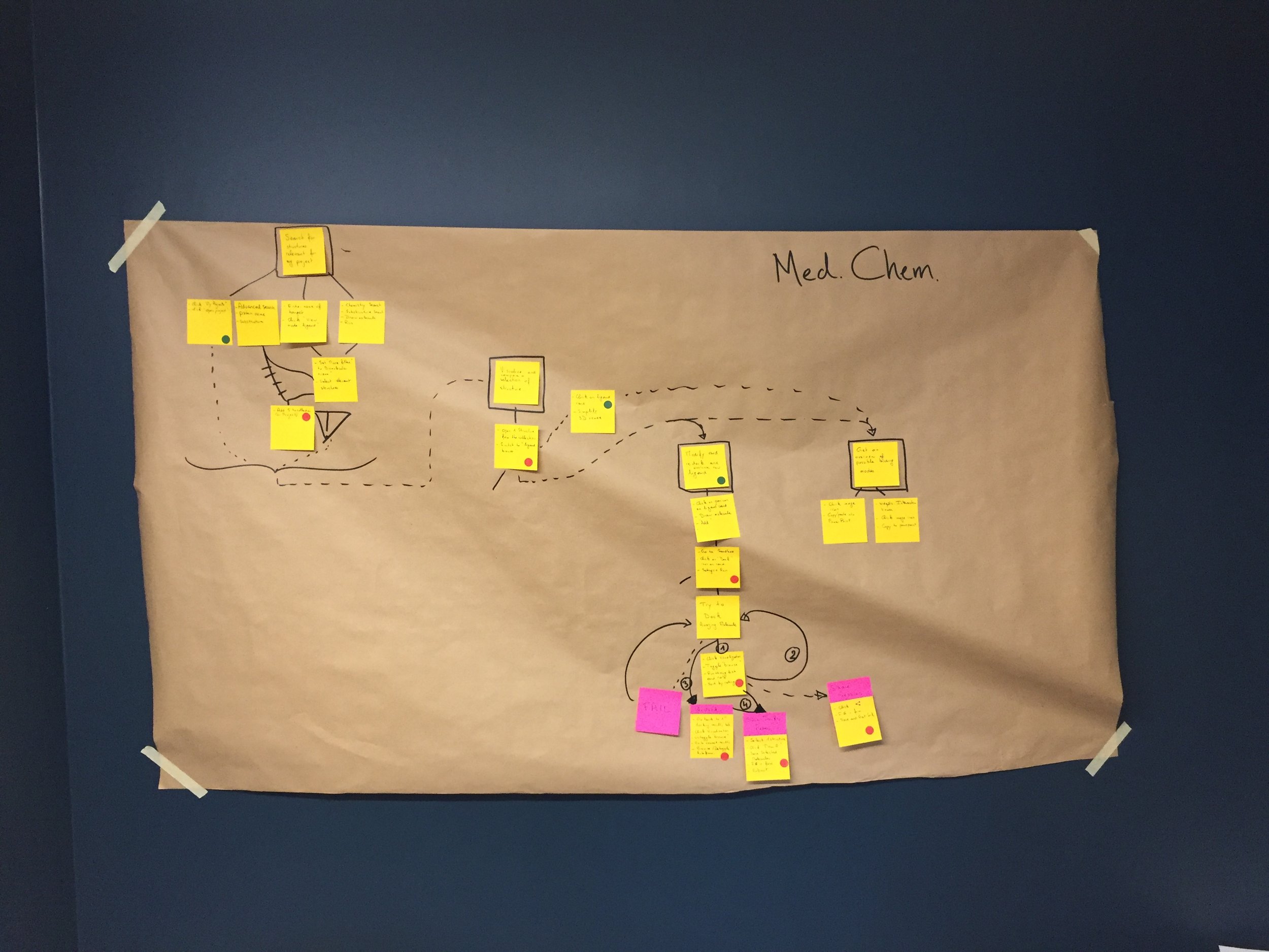
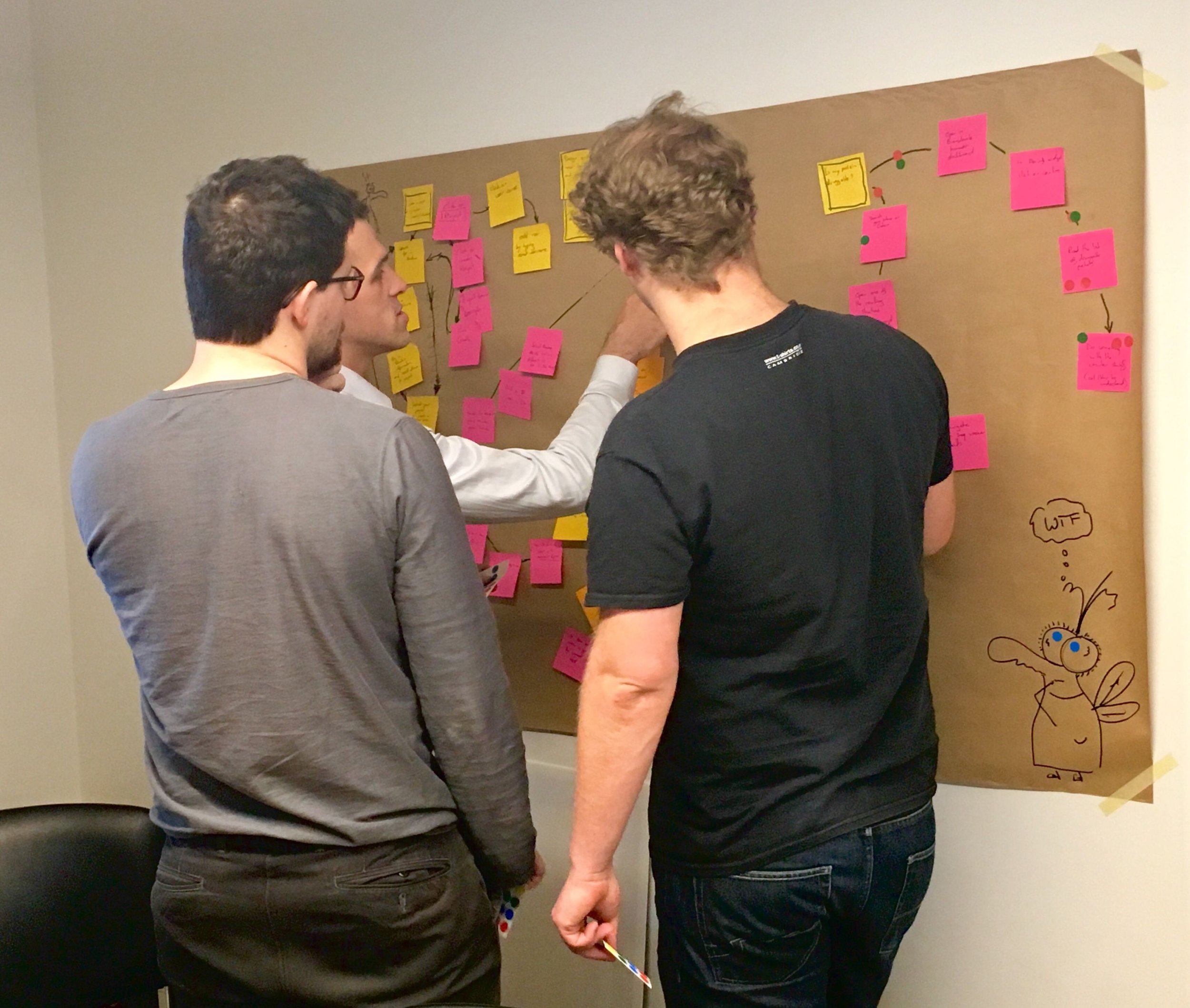
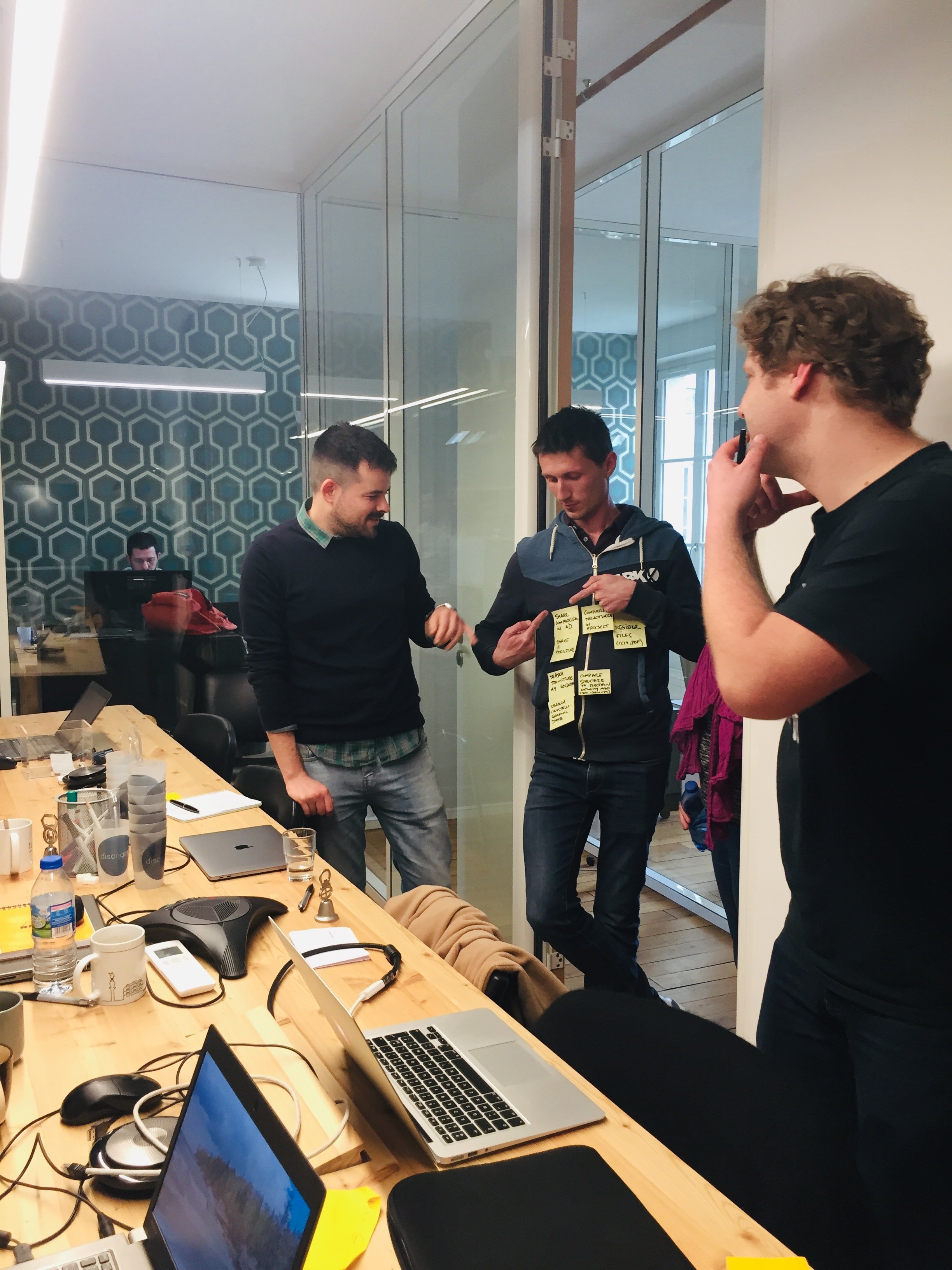
We split the project into three parts. The first one was without a doubt the most important. We conducted interviews and practical sessions with our customers to gather raw feedback, observe their reactions and comments while trying to find their way through the application. Some were utterly lost, others would find their way after playing around with the app, and a few managed to get things done. One thing, in particular, was highlighted: the users needed more guidance. User Studio taught us how to collect and process UI feedbacks efficiently, list every possible interaction in the app, and made us take a step back to look at the big picture. This preliminary work allowed us to look at 3decision from a new perspective. We refocused on ourselves, as a team, and on what we wanted to offer as a product. After taking care of this huge navigation issue, things were a bit clearer for all of us.
From this point, it became much easier to move on to the two remaining parts which were the redesign of two big features - a proper workspace adapted to sets of multiple structures and ligands, and a well-designed docking results viewer. In these two final redesign steps, we saw the benefits of the new way of navigating within 3decision. We also took the opportunity to let User Studio help us list the basic principles for us to follow for future interface concepts.
How was the collaboration with Discngine?
There were two collaboration phases and our role and attributions towards working with Discngine team changed from one phase to another over the course of those phases.
We initiated collaboration by immersing ourselves into the tool, the science, and the spirit of the company we were starting to work with. Understanding what their work is about and what kind of users we’d be dealing with in the end, thus understanding the span of the mission and finding out how it would unwrap precisely over the new few months.
They were very patient! Giving us time to immerse ourselves into this particularly complex and exotic field. Do you know what a ligand is? Well, we do now!
We then set on the challenging path of helping Discngine’s team in taking a step back, retro engineering some of their achievements on 3decision and analyzing what had worked and what had not in order to set sail on a new creative pathway after thoroughly reassessing and strengthening the value proposition.
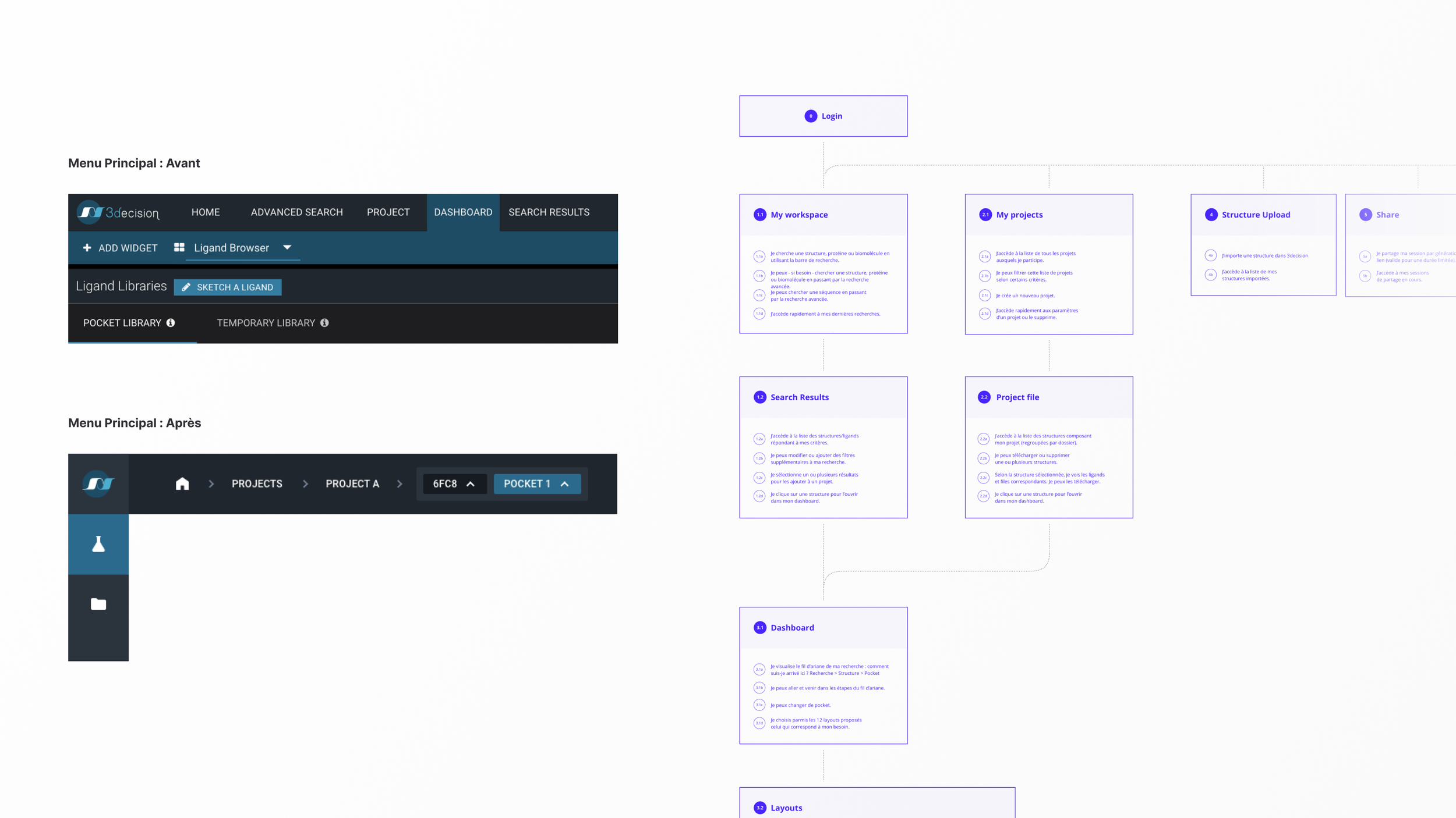
That led to redesigning the core architecture of the tool and giving the team a glimpse of what would be to come during the next step: actual screens.
So eventually, we transitioned to a second phase where we acted as design consultants: we mentored (and nurtured) them into designing their tool’s new features; we challenged them into working with a more intuitive approach without sacrificing coherence; all the while respecting the user journey that we had cleaned up and simplified. We enjoy taking that approach instead of doing the more traditional design&deliver work we usually do. The mentoring version of our job is specifically adapted to teams of developers that have their hands into front-end design anyways every day.
“The Discngine team is one of a kind: a special cocktail of scientific excellence and strong developer skills served by very bright minds capable of turning their knowledge of the field into tools that their clients would not even dream of ever owning.”
What major evolutions have you implemented on 3decision?
I think the real main improvement is to be able to work with multiple structures at the same time along with the concept of “Workspace” which is a summary of the structures and ligands a user is working with. This core feature is the result of a combined effort and meticulous examination, interpretation of customer feedback from both teams. This will become the main starting point of every important action that users want to take in their day-to-day activity.
“Bye-bye widgets, welcome static screens, and breadcrumb!”
We’ve ditched redundant paths to bring more clarity and adapted specific displayed information to the user’s profile (e.g.: medicinal chemist, crystallographer, etc...) to efficiently guide users through the application.
Regarding esthetics, 3decision has been reborn. Where we used to have a patchwork of styles that confused the users instead of helping them, we now have styles that are clean, easy to read, and standardized. Since the readability does not rely only on graphics, we also improved the semantics. Menus, labels, and actions have now a better description of the action behind them.
Behind the scenes, User Studio continuously educated us with tips on UX, prepared complete screens of how new features would look connected, and provided a UI Kit. This UI Kit is now the reference for 3decision’s styles. It holds the sizes, colors, icons, navigation, element states, and design concepts for each object we want to represent on screen. All this combination of research, challenges, and opportunities keep bringing us new horizons of improvement into view. We have a myriad of new ideas to implement and adjustments to make in the foreseeable future.
The user interface’s architecture is now intuitive, easy, and fun to use and the users are autonomous. Furthermore, the graphical experience is more consistent throughout the software and it really brings out its groundbreaking features.
“Above all, the team is now « design-skilled » enough and equipped with enough assets to make the product evolve in the future while respecting a UX/UI design system that will facilitate the undertaking of new features.”
What were the key success factors for this project, from your point of view?
From my perspective, the main reason for the project’s success is the human factor.
“We got along right from the start and they perfectly molded to our way of working as a team. ”
This is a great basis for trust. What’s more, they were able to quickly understand all the scientific concepts, the problems we had and could efficiently suggest good solutions. This is exactly what we needed and something I truly admire. Having external contributors without being “corrupted” by a scientific background, was very positive to bring fresh ideas and insight.
After benchmarking other apps, I also realized that most of life science software often display too much data in a (very) limited area when users don’t necessarily need all that. Everything quickly becomes clunky and not so pretty. This also makes the learning curve for new users quite important.
With 3decision, we offer a clean, intuitive and beautiful interface, we’ve pushed the thinking a bit further to strip out what is not necessary to bring the focus back on what matters the most to our customers: Data
Discngine’s team was so warm welcoming! We felt we were an actual part of the 3decision team right away (and still kind of feel that way!) and that made all the difference: trust built-in. Their forgiveness in our newbie knowledge of biochemistry was instrumental for us to gain confidence in working with them. And eventually, the team continuously evaluated and ensured the feasibility of our design proposals, which helped streamline the design process tremendously. They were extremely reactive and available, which is always an essential asset in order to understand the subtleties of the services we work on and to let our creativity express itself to its full potential.
Last but not least, a key aspect of this success story was the fact that right from the beginning, we were able to take advantage of the Discngine team's ultra-fine user knowledge, and got access to some key user profiles:
“that kind of user research is not always easy to organize within professional tools projects, even though it always gives us the best edge at understanding user context, potential needs, complaints, etc. Kudos for this!”
To conclude
UI/UX had been integrated into general software development years ago. Despite its proven results, it can sometimes be judged as less important than features in scientific software solutions. With the introduction of 3decision v2, Discngine wishes to participate in showing the importance of bringing UX/UI in life science research software applications.
This movement is also supported by major players in our industry. A quick look at the UXLS project, initiated by the Pistoia Alliance, will also show you the importance of this approach.
Improving the UX and the UI of scientific software solutions is essential but finding the right partner to do it is equally important. By choosing UserStudio, the 3decision team selected the right ally to achieve this project.
If UX/UI is of interest to you, we really recommend taking a look at their website!
Find the article in French on UserStudio’s website here.


