Using Adobe XD for Scientific Web app development - do your mockups
This time around you won’t see any source code. Sorry about that, next time maybe.
Here I’ll talk more about sometimes overlooked aspects when developing applications for R&D in life sciences. So I guess this post might be useful to our competitors or people developing applications within large corporations in the life science & pharma industry … anyway ;)
I’ll take the example of our current 3decision developments. You might have heard or read about 3decision already before. If not, check it out - 3decision .. it’s super cool!
When presenting 3decision to prospects that have never seen the web interface of the application before, we often get very very positive reactions on the way it looks and the very first impression is that it looks intuitive and modern.
This very first reaction is probably also due to the fact that UI’s of most scientific software used in early stage drug discovery are likely not beautiful, easy to use etc.
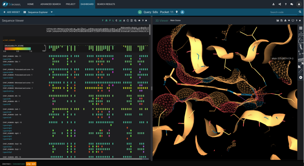
3decision’s sequence explorer layout - just as an example
The importance of a mockup
Until recently we did not systematically use mockups for all UI/UX related developments. That’s bad, but in the course of the project, especially the early stages we managed reasonably well. The first issues arise when the following two things happen:
your customer base increases - you get more input
the size of your development team increases significantly - which happened to us as well
Communication is key
1: Let us consider point #1 first. Once you get more customers and you treat them gently (like we are always trying to do ;)) then you actually can get more feedback on your current developments. This feedback can be very divergent from one customer to another but also strikingly convergent on some aspects, like the UI. Suddenly you might notice, ok the UI is beautiful, but the flow in the app (the user experience part; UX) is actually not that straightforward as you first thought.
Also, when communicating on your roadmap with a user it’s actually really good to be able to cross-check whether a feature you want to integrate is actually understandable by the user in the end - before actually integrating it.
2: As your team grows in size you have to communicate to your new developers new features and what should be changed in the application. That works well on a macroscopic level describing on what should be done, but once you are down to the little details things usually get tricky. The same is rather true for explaining whole workflows within the application. And let’s not talk about explaining about some of the communication barriers between scientists and pure informaticians.
The worst thing that can happen when not doing a mockup: you develop something that doesn’t fit the user needs / requirements / expectations.
At some point during the past year we observed a few of these issues and introduced systematic mockups in our front-end development process.
Isn’t a modified screenshot enough?
As usual, that depends. In the case of the 3decision development, but also on other projects we are currently running we find it very useful to capture aspects of the UI, but also the navigation in the application. That means we provide screens the users would see, but also means to simulate the navigation and the flow within the application.
So the bottomline is, on complex scientific applications - being able to simulate the navigation behaviour of the user is really important to capture potential bottlenecks, but also harmonise parts of the application.
What we are currently using
Within Discngine we use plenty of tools and if you look around on one of those 20 best mockup tool listings you probably already heard of Balsamiq, Sketch, Justinmind etc.
There are tons of tools out there and finding the one just right for the job can be complicated. In the case of our 3decision development we were looking for a tool able to allow the following things reasonably well:
create wireframes/mockups of key screens
provide means of navigation between key screens (simulate flows)
allow to share the mockup on the web or via video so users can give feedback
optionally allow us to build our UI kit
should be easy to use
not horribly expensive (some of these tools can be)
Adobe XD
First of all…I’m not an Adobe salesman…I just present a tool that does the job and it’s free actually!
I stumbled upon Adobe XD by pure chance when updating my Adobe account to work with lightroom and photoshop. With it I saw that Adobe now had a UI/UX design software as well. Back at the time it was rather basic. Likely too basic as a start compared to wireframe toolkits built for that purpose, but they actually made quite good improvements to it recently and in the end it checked all of our criteria listed above.
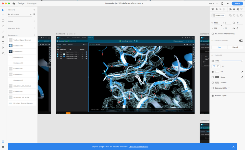
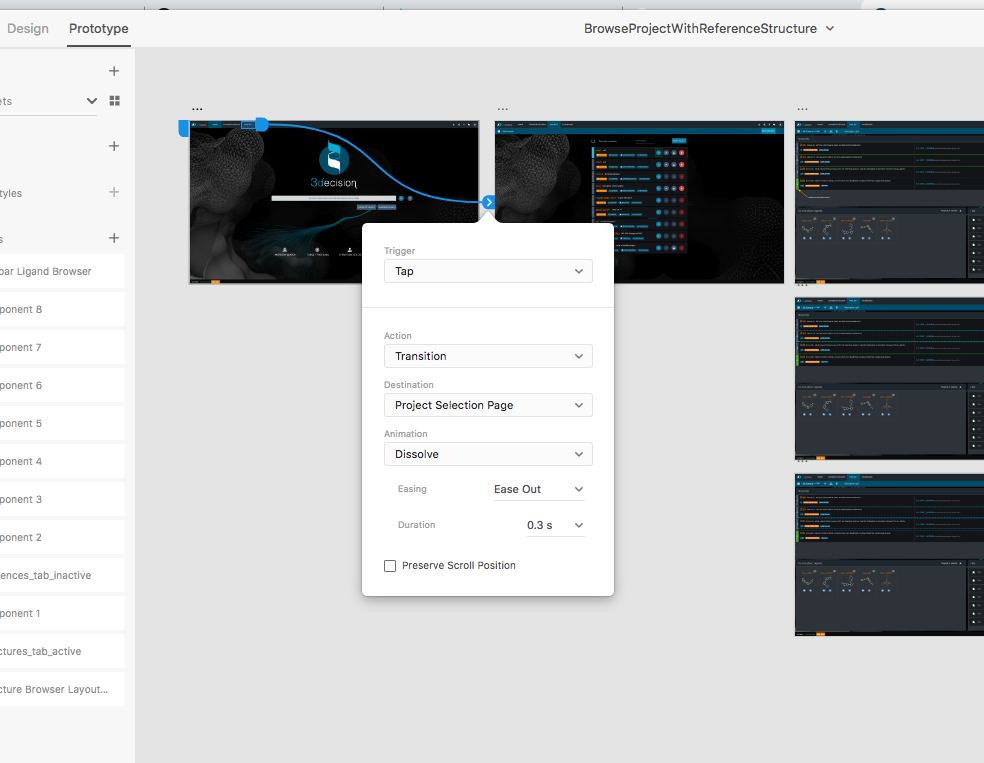
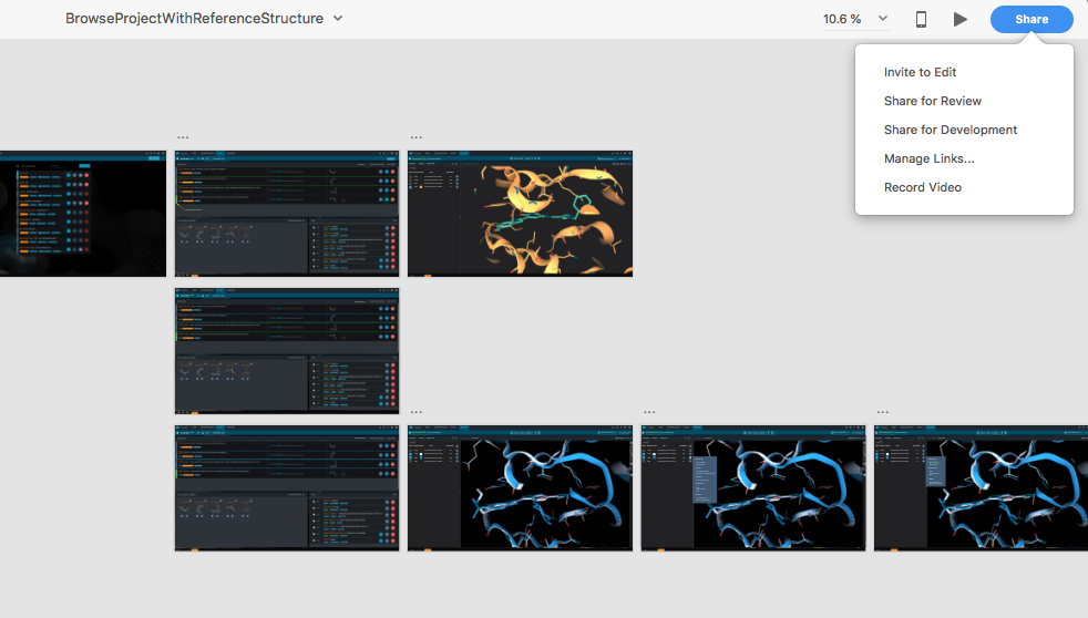
The learning curve for it is not that steep, but the concepts are very different to other UI/UX softwares out there.
I really recommend to start with one of the sample UI or wireframe kits available online. From there you can get a very quick set of things done just by copy and pasting elements and arrange them on your screen. The prototyping (workflow) part is super easy to handle and the sharing part as well.
Our experience so far
we can give early visual feedback to our users and assess different UI options before developing them - this can be done via webex, or via sharing a link where users can “use” the mockup as if it was the real application and they can comment while doing that
creating detailed mockups clarifies the communication within the development team as well in terms of outcome needed. The team is much better aligned and (i) potential bottlenecks can be discussed before development and (ii) it eases up a lot communication between scientists and informaticians.
The overall experience is very positive. Even though creating mockups and workflows is a time consuming task, we really really feel it’s worth in terms of outcome.
Further reading
There are tons of resources on the internet on Adobe XD, youtube videos websites. Probably stay away from those websites selling design kits. There are quite a few free ones available. Start for instance with the one provided by Adobe:
https://www.adobe.com/products/xd/resources.html
Acknowledgements
Here I must highlight that most of the early front-end development work on 3decision was done by Daniel Alvarez Garcia and later the team was completed by Elodie Philippe….kudos to both for the great work!

